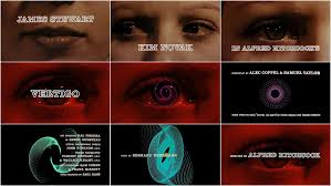
Saul Bass is known for work on the title sequence of films such as Goodfellas, vertigo and Psycho where we worked with Pablo Ferro. Bass was known for using a new type of "kinetic typography" which he used in Vertigo and Psycho.

Pablo Ferro has been working with moving image for over 40 years. This includes Stanley Kubrick's Dr Strangelove. He has received the Chrysler Design Award, the Art Director Club Hall of Fame Award and the AIGA Medal.

The next point is "in one of his interviews, Kyle Cooper states that while the power of computer graphics is obvious, he still likes experimenting with live action, because there is something special about the imperfection of making things by hand." I agree with this statement. It feels more gratifying in making something without the aid of computer programs as you have more freedom in being able to do what you want and actually doing, not some computer program helping you and as a result your work may not be perfect but something perfect in the sense of making an opening sequence would be boring.
"Waltograph was created by Justin Callaghan in an attempt to capture the spirit of the familiar Walt Disney signage". The font itself looks very much like Walt Disney. I find this interesting as it shows how much of an influence these big companies have on people. People are making things in tribute. Justin Callaghan also has a variety of fonts seen in Walt Disney movies and place son the website MickeyAvenue.com

The final point I will talk about is also the final point in the article. "As designers have always known, the opening moments can make a deeply satisfying contribution to any film". As someone who often watches both films and television series the opening sequence puts you into the mood of the film and should give you a rough idea on the feel of the film. If I am not really feeling the begging then I wont necessarily stick through the whole film. First impressions are everything as you may not always get a second chance.
No comments:
Post a Comment